Tisagni
Branding & Packaging
Seamlessly blending minimalism and apothecary in hand care
The Brand
Tisagni was built on the foundation set by a rejected brand proposal. The original client was looking for a high-end skincare brand that would feel elegant, luxurious and unique.
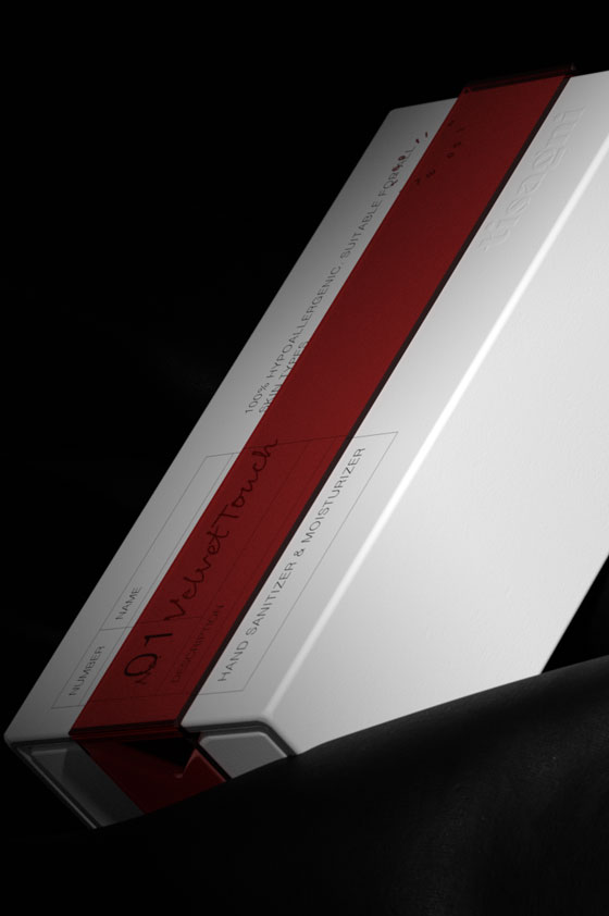
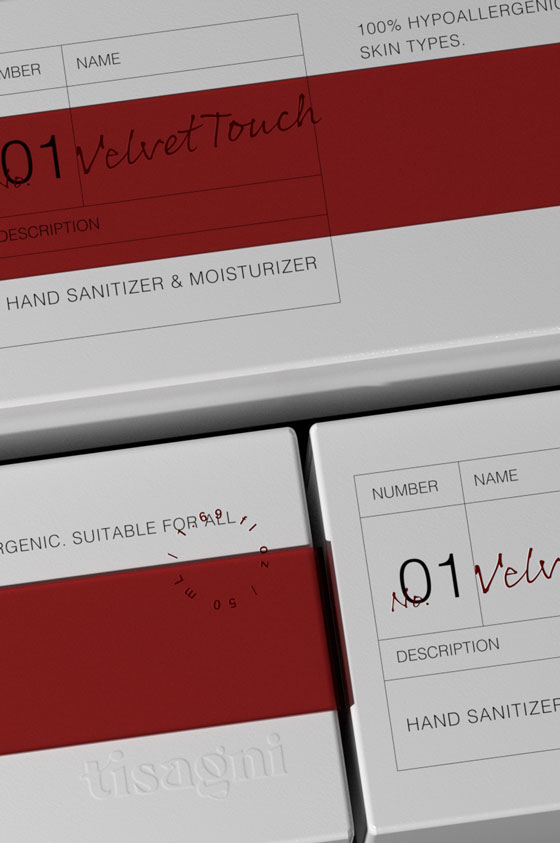
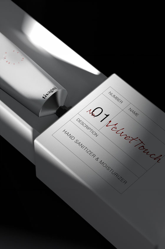
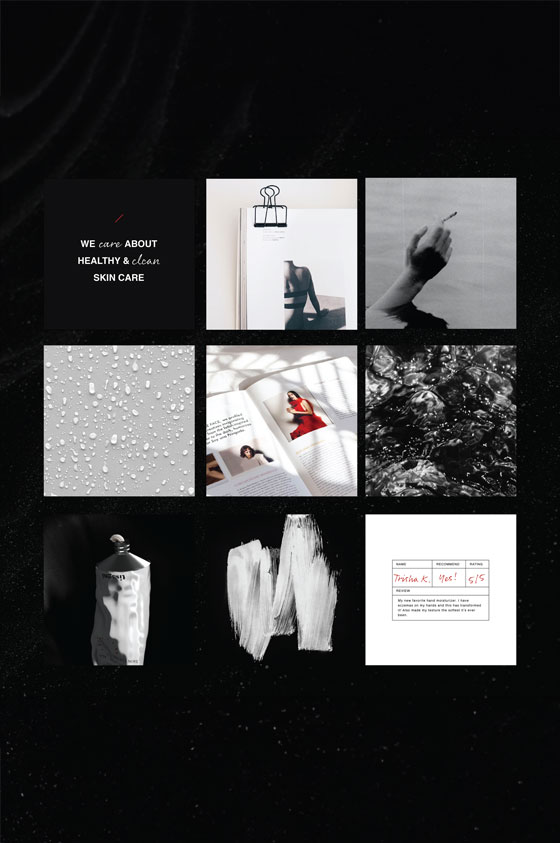
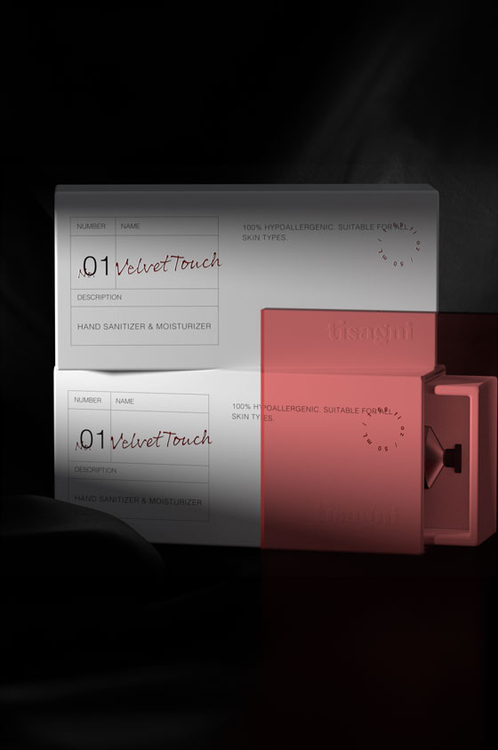
This identity draws inspiration from the apothecary and editorial styles, approached in a clean and minimalist way. The packaging, displaying only the essential information for the product, and the use of a metal tube as a vessel allowed us to double down on this aesthetic. The use of a script typeface creates a distinct look while giving the brand a hint of exclusivity.


